Plik:IncomeInequality9b.svg

Wielkość pliku podglądu PNG dla pliku SVG: 600 × 600 pikseli Inne rozdzielczości: 240 × 240 pikseli | 480 × 480 pikseli | 768 × 768 pikseli | 1024 × 1024 pikseli | 2048 × 2048 pikseli | 630 × 630 pikseli.
Rozmiar pierwotny (Plik SVG, nominalnie 630 × 630 pikseli, rozmiar pliku: 126 KB)
| Plik IncomeInequality9b.svg znajduje się w Wikimedia Commons – repozytorium wolnych zasobów. Dane z jego strony opisu znajdują się poniżej. |
Opis
| Opis |
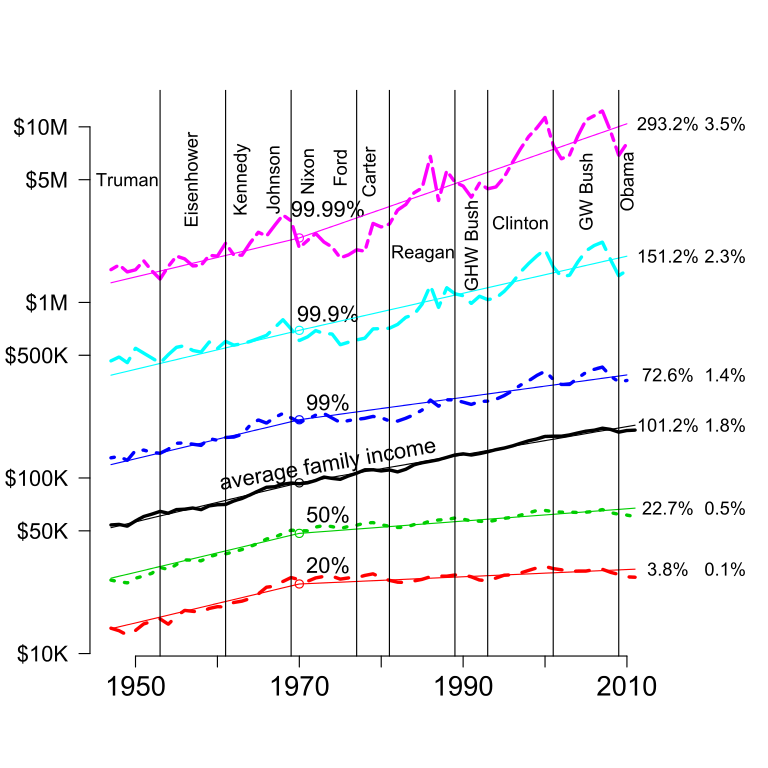
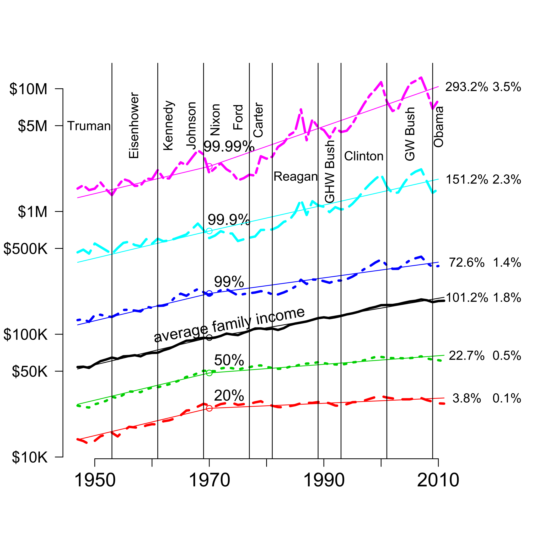
English: This graph shows the income of the given percentiles plus the average from 1947 to 2010 in 2010 dollars. The 2 columns of numbers in the right margin are the cumulative growth 1970-2010 and the annual growth rate over that period. The vertical scale is logarithmic, which makes constant percentage growth appear as a straight line. From 1947 to 1970, all percentiles grew at essentially the same rate; the light, straight lines for the different percentiles for those years all have the same slope. Since then, there has been substantial divergence, with different percentiles of the income distribution growing at different rates. For the median American family, this gap is $39,000 per year (just over $100 per day): If the economic growth during this period had been broadly shared as it was from 1947 to 1970, the median household income would have been $39,000 per year higher than it was in 2010. The median was computed as the geometric mean of the 40th and 60th percentiles. Those two quantiles and the 20th percentile came from US Census Bureau Table F-1.[1] The 99th, 99.9th, and 99.99th percentiles were computed from US Internal Revenue Service data by Piketty and Saez.[2] There are systematic differences between these two sources, but the differences are small relative to the scale of this plot.[3] |
| Data | |
| Źródło | Praca własna |
| Autor | DavidMCEddy |
Licencja
Ja, właściciel praw autorskich do tego dzieła, udostępniam je na poniższej licencji
Ten plik udostępniony jest na licencji Creative Commons Uznanie autorstwa – Na tych samych warunkach 3.0.
- Wolno:
- dzielić się – kopiować, rozpowszechniać, odtwarzać i wykonywać utwór
- modyfikować – tworzyć utwory zależne
- Na następujących warunkach:
- uznanie autorstwa – musisz określić autorstwo utworu, podać link do licencji, a także wskazać czy utwór został zmieniony. Możesz to zrobić w każdy rozsądny sposób, o ile nie będzie to sugerować, że licencjodawca popiera Ciebie lub Twoje użycie utworu.
- na tych samych warunkach – Jeśli zmienia się lub przekształca niniejszy utwór, lub tworzy inny na jego podstawie, można rozpowszechniać powstały w ten sposób nowy utwór tylko na podstawie tej samej lub podobnej licencji.
- ↑ Table F-1. Income Limits for Each Fifth and Top 5 Percent of Families[1], (Please provide a date or year), Wikidata Q98791666.
- ↑ Piketty, Thomas; Atkinson, A. B., ed.. Income Inequality in the United States, 1913-2002. Retrieved on 2012-02-08.
- ↑ The differences between the Census and Internal Revenue Service Data can be seen most easily in the 95th percentile, present in both data sets. For more details see “incomeInequality”, in Ecdat: Data Sets for Econometrics[2] (in en), (Please provide a date or year), Wikidata Q105622666.
Historia pliku
Kliknij na datę/czas, aby zobaczyć, jak plik wyglądał w tym czasie.
| Data i czas | Miniatura | Wymiary | Użytkownik | Opis | |
|---|---|---|---|---|---|
| aktualny | 08:46, 3 lut 2013 | | 630 × 630 (126 KB) | DavidMCEddy | User created page with UploadWizard |
Lokalne wykorzystanie pliku
Poniższa strona korzysta z tego pliku:
Globalne wykorzystanie pliku
Ten plik jest wykorzystywany także w innych projektach wiki:
- Wykorzystanie na en.wikipedia.org
- Wykorzystanie na en.wikiversity.org
- Documenting crony capitalism
- Cost of crony capitalism in the United States
- Media and taxes
- Net neutrality and 'Restoring Internet freedom'
- Media and Democracy in Kansas City and Elsewhere
- Confirmation bias and conflict
- Electoral integrity in the United States
- Social construction of crime and what we can do about it
- Information is a public good: Designing experiments to improve government
- Wykorzystanie na zh.wikipedia.org